Finally, The Celtics Have A New City Edition Alternate Jersey That Isn't A Complete Disaster
 Brian Babineau. Getty Images.
Over the years, we've been subjected to some truly horrific Celtics alternate jerseys. It's a tough ask considering their traditional look is as close to perfection as humanly possible and is one of the most iconic jerseys in not just all of basketball, but all of sports. Usually when we get an alternate, there's a very slim chance that it works out. There are of course some exceptions, but overall? It's more often a disaster than not. We've seen everything, including some clear misses like when they went with the whole gray sleeved look (gross, sorry if this offends)
 Mike Lawrie. Getty Images.
to whatever the hell they thought this shit was last year (again, sorry if this offends)
 Jesse D. Garrabrant. Getty Images.
and it got to the point where part of me felt like Nike did that shit intentionally as payback for the whole Jaylen Brown drama (I'm delusional, we knew this). So you can imagine my intrigue when the team put out this promo yesterday
If you had seen the leaks floating around the internet, you knew what this meant. Well, now that things are officially confirmed let's have ourselves a look
Immediate reaction?
Now that I've calmed down, a few thoughts
1. This is easily one of the best alternates the Celts have had in recent seasons. The options in 2022 and 2023 grew on me over time (more "fine" than "good" to me), but I personally have this one ahead of those. In fact, it might be the best one since 2018-19. Finally, Nike didn't screw us.
2. Someone is going to have to explain to me how in their title defense season of 2024-25 that they did not go with this look and instead went with that neon bullshit? If the whole point is your timeless tradition of winning/gold etc….wouldn't it have made sense to wear these as the defending champs? Compared to what we actually got, that's a disaster. Call me crazy, but that feels like a no brainer?
3. I think one of the main reasons why I like this look is that it's the closest we've been to one of my favorite Celts' alternate jerseys of all time. My guess is it's one of your favorites too. This bad boy
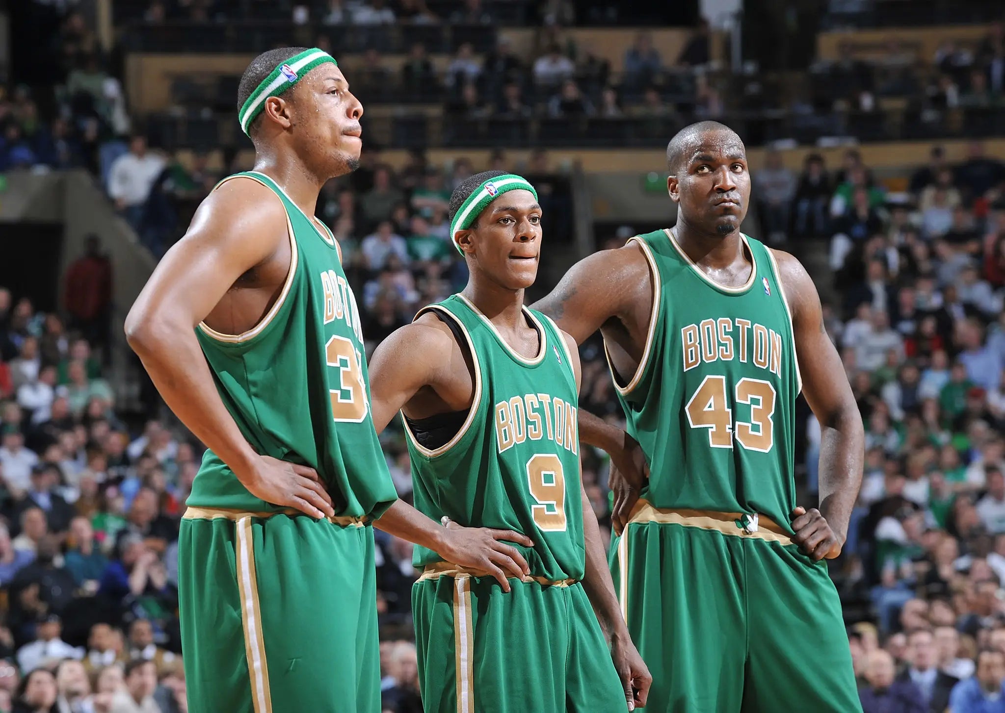 David Dow. Getty Images.
Advertisement
if I had my preference, we would have gotten the green jersey this year instead of the white. You're telling me it wouldn't have been awesome to bring that look back for the games at home on 3/16 vs PHX and 3/18 vs GS which sandwich Saint Patrick's Day? Of course it would have been, but oh well. At least they got close.
4. It's complete bullshit that Nike decided to do this in a year where there's a good chance that Jayson Tatum never plays. I know everything that happened yesterday, but I'm still not letting my brain go there. For now, he's sitting the whole year to my idiot brain, and as a result, it's bullshit he's being robbed of rocking these.
5. I wish they also released the shorts in those photos, so for now, the leak of the full uniform will have to do
Not terrible. I kind of prefer if it were just a clean all white with the gold shamrock instead of having that golf strip on the side, but that's nitpicking. I guess that works since it lines up with the side of the jersey, so fine. Overall, it's still a clean look, which I appreciate. Where we've seen the Celts get into trouble with these is when Nike tries to do too much. The Celts' clean look is a classic, you don't need to overdo it in my opinion.
All in all, I'm considering this a win. Given what we've had to live through in the past, this is roughly a billion times better, so I guess that's progress? Lord only knows how many wins we'll end up seeing in 2025-26, so I'll take whatever positivity I can get at the moment.
My official grade? 8.6/10. Good job.